Say you want to plot some data. You could just plot it by itself:

Or you could put lines on the left and bottom:

Or you could put lines everywhere:

Or you could be weird:

Which is right? Many people treat this as an aesthetic choice. But I’d like to suggest an unambiguous rule.
- Principles
- Years vs. GDP
- Years vs. GDP again
- Years vs temperature
- Homeowners vs. cannabis
- Lines can also be used for evil
- Related advice
- Axis lines ≠ tick marks
- Matplotlib’s tragic defaults
Principles
First, try to accept that all axis lines are optional. I promise that readers will recognize a plot even without lines around it.
So consider these plots:

Which is better? I claim this depends on what you’re plotting. To answer, mentally picture these arrows:

Now, ask yourself, are the lengths of these arrows meaningful? When you draw that horizontal line, you invite people to compare those lengths.
You use the same principle for deciding if you should draw a y-axis line. As yourself if people should be comparing the lengths:

Years vs. GDP
Suppose your data is how the GDP of some country changed over time, so the x-axis is years and the y-axis is GDP.

You could draw either axis or not. So which of these four plots is best?

Got your answers? Here’s a key:

Why?
-
GDP is an absolute quantity. If GDP doubles, then that means something. So readers should be thinking about the distance between the curve and the x-axis.
-
But 1980 is arbitrary. When comparing 2020 to 2000, all that matters is that they’re 20 years apart. No one cares that “2020 is twice as far from 1980 as 2000” because time did not start in 1980.
Years vs. GDP again
Say you have years and GDP again, except all the GDP numbers are much larger—instead of varying between 0 and $3T, they vary between $50T and $53T.

What to do? In principle you could stretch the y-axis all the way down to zero.

But that doesn’t seem like a good idea—you can barely see anything.
Sometimes you need to start the y-axis at $50T. That’s fine. (As long as you’re not using a bar chart.) But then, the right answer changes.

The difference is that $50T isn’t a meaningful baseline. You don’t want people comparing things like (GDP in 1980 - $50T) vs. (GDP in 2000 - $50T) because that ratio doesn’t mean anything.
Years vs temperature
What if the y-axis were temperature? Should you draw a line along the x-axis at zero?
-
If the temperature is in Kelvin, then probably yes.
-
If the temperature is in Fahrenheit, then no. No one cares about the difference between the current temperature and the freezing point of some brine that Daniel Fahrenheit may or may not have made.
-
If the temperature is in Celsius, then maybe. Do it if the difference from the freezing point of water is important.
Of course, if the freezing point of water is critical and you’re using Fahrenheit, then draw a line at 32°F. Zero and one are the most common useful baselines, but use whatever is meaningful.
(Rant about philosophical meaning of “0” and “1” and identity elements in mathematical rings redacted at strenuous insistence of test reader.)
Homeowners vs. cannabis
Sometimes you should put lines at the ends of axes, too. Say the x-axis is the fraction of homeowners in different counties, and the y-axis is support for legal cannabis:

Should you draw axis lines? Well, comparisons to 0% are meaningful along both axes. So it’s probably good to add these lines:

But comparisons to 100% are also meaningful. So in this case, you probably want a full box around the plot.

Lines can also be used for evil
Lots of people hate the Myers-Briggs personality test—suggesting that you should use a created-by-academic-psychologists test like the Big Five instead. I’ve long held this was misguided and that if you take the Myers-Briggs scores (without discretizing them into categories) they’re almost equivalent to the Big Five without neuroticism or “Big Four”.
So I was excited to see some recent research that tests this. They had a bunch of people take various personality tests and then rate themselves on 40 life outcomes, e.g. how happy they were and how many friends they had. They then looked at the correlation between personality tests and life outcomes:
| Test | Correlation |
|---|---|
| Big Five | 0.23 |
| Big Four | 0.18 |
| Myers-Briggs scores | 0.15 |
| Myers-Briggs categories | 0.11 |
| Astrology | 0.002 |
Here, the correlation is an R value—0 means a test tells you nothing about life outcomes, and 1 means the test allows you to predict life outcomes perfectly. So this suggests the Big Four is similar to Myers-Briggs scores, but maybe a little more informative.
But we’re here to talk about figures, not psychology. So look at how the above numbers were pictured in Scientific American:
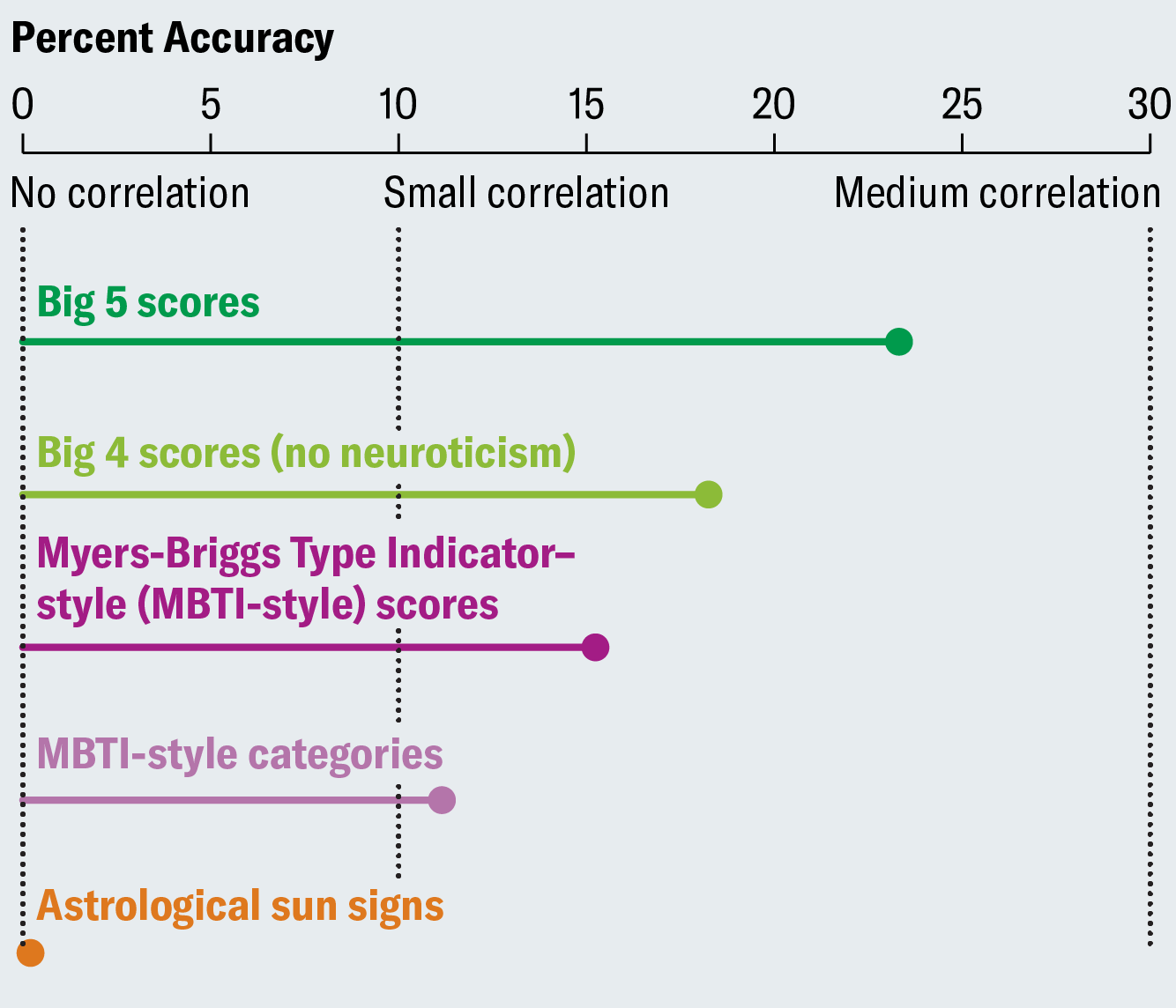
That “small correlation” line is genius—your eye naturally compares the dots to it, rather than the “no correlation” line, giving the impression that the Big Four is twice as good as the MBTI. Of course, the difference between a correlation and a “small correlation” threshold is not something that anyone could conceivably care about.
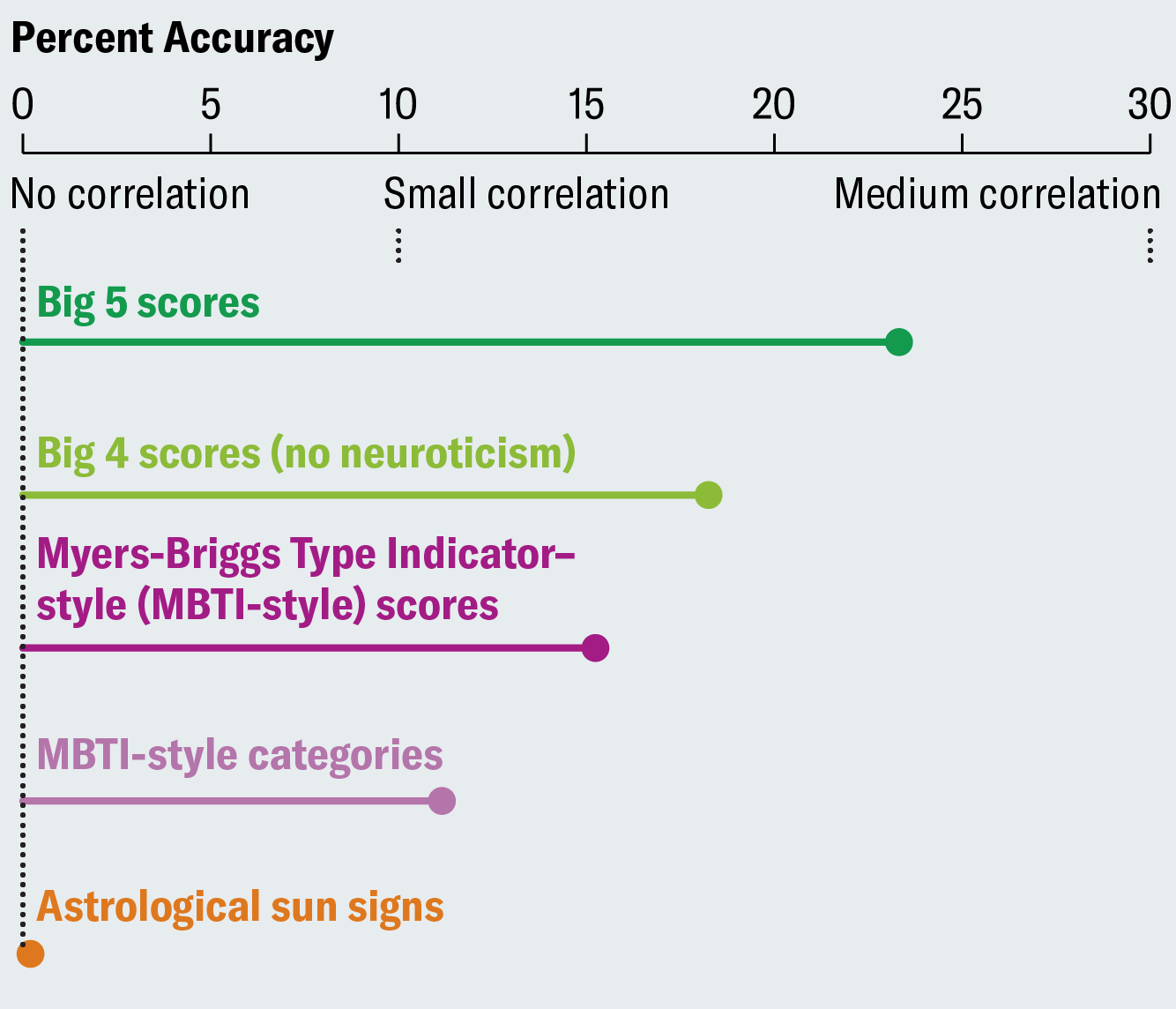
A plot that follows the rules I laid out here is much less misleading:
Related advice
Andrew Gelman advises, “If zero is in the neighborhood, invite it in”. The idea is that if your plot almost includes zero, and zero is meaningful, then extend the y-axis down to zero. He gives this example:
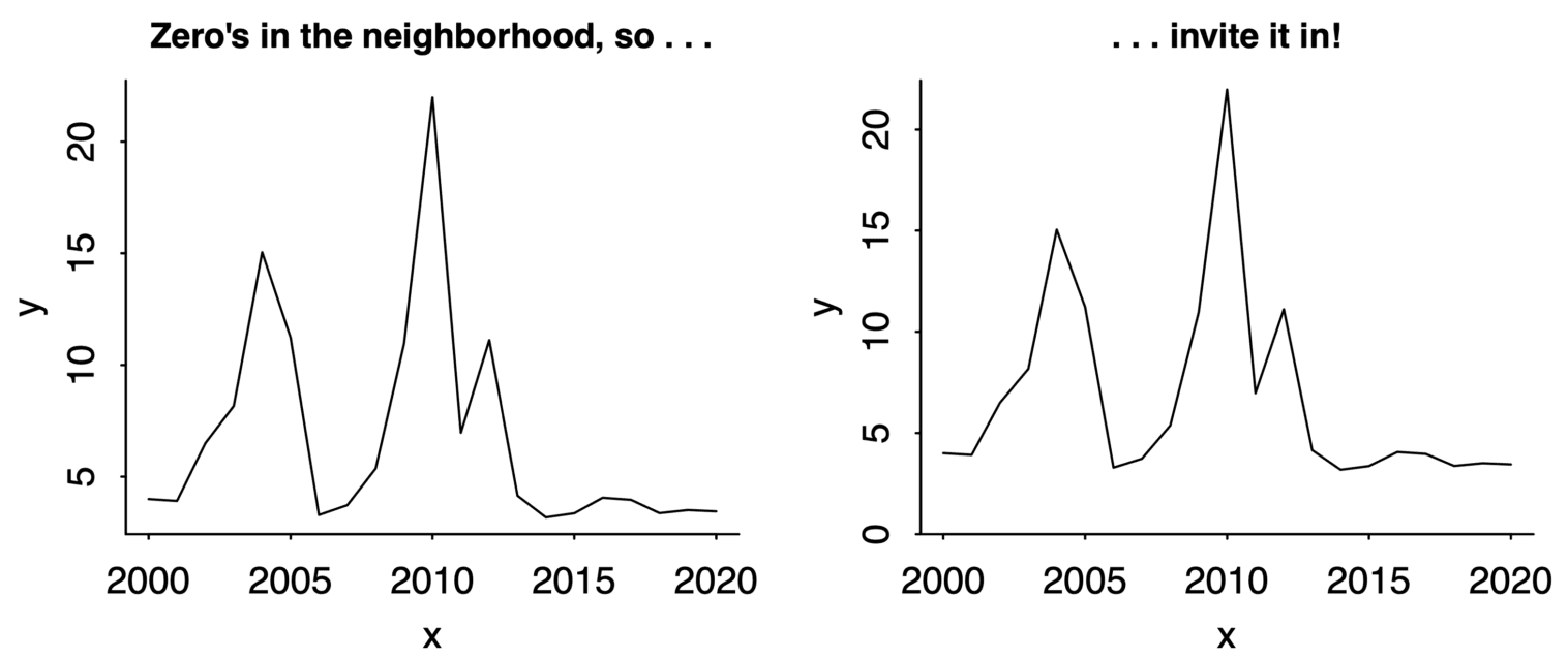
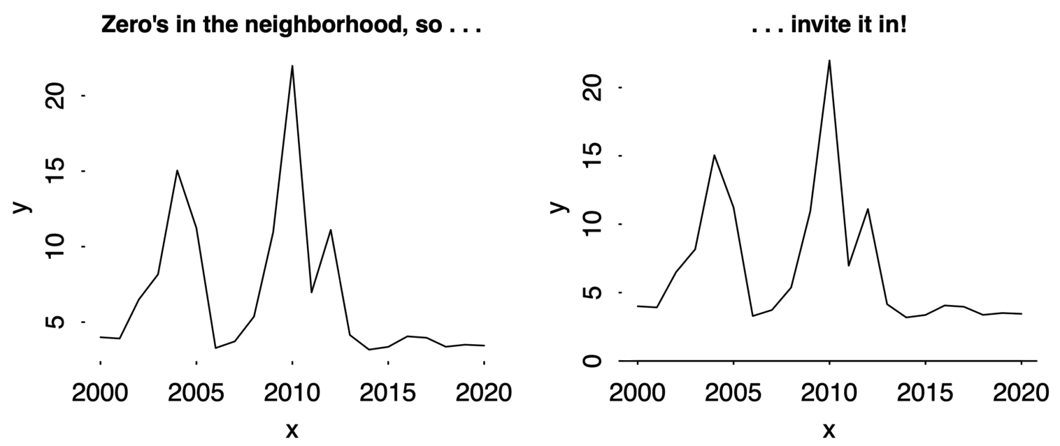
I agree with this advice, though I’m not sure about that vertical line. Is “time since the Slim Shady LP came out” paramount here? And if you don’t extend the y-axis to zero, then you shouldn’t draw a horizontal line either. So I think this would be a better demonstration of the principle:
Axis lines ≠ tick marks
On a related note, see how there are tick marks in the previous plots, even when there are no axis lines? You can do that. It’s fine. Put tick marks wherever you want. Tick marks are no excuse for axis lines.
Matplotlib’s tragic defaults
Matplotlib is a popular plotting library. Here’s an example of using it:
time = [0,1,2,3,4,5]
speed = [1,.3,.2,.1,.03,.01]
plt.plot(time,speed)
plt.xlabel('Time (s)')
plt.ylabel('Speed (m/s)')

I don’t want to quibble with the default of adding axis lines everywhere. After all, there has to be some default, and if the right choice depends on the semantics of the data, then you can’t expect the plotting library to guess that.
Except, I can’t not quibble because there’s a more serious problem. Do you see it? Here’s a little hint: